Segmented Marketing for Academic Programs
LANDING PAGES FOR A MARKETING CAMPAIGN
My role
design and layout strategy
information architecture
visual design
low-fidelity wireframes
high-fidelity mockups
front-end development
My role
design and layout strategy
information architecture
visual design
low-fidelity wireframes
high-fidelity mockups
front-end development
OVERVIEW
As a way of increasing overall enrollment and strengthening recruitment efforts, Gordon College initiated a differentiated/segmented marketing campaign in addition to their regular recruitment strategies. Based on research, four areas of study were chosen to be targeted in this academically-focused campaign. The target market would include all stages of the enrollment funnel—from the discovering stage through the admit stage.
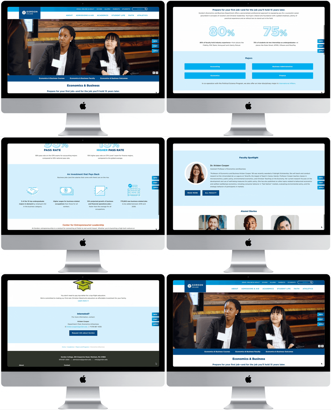
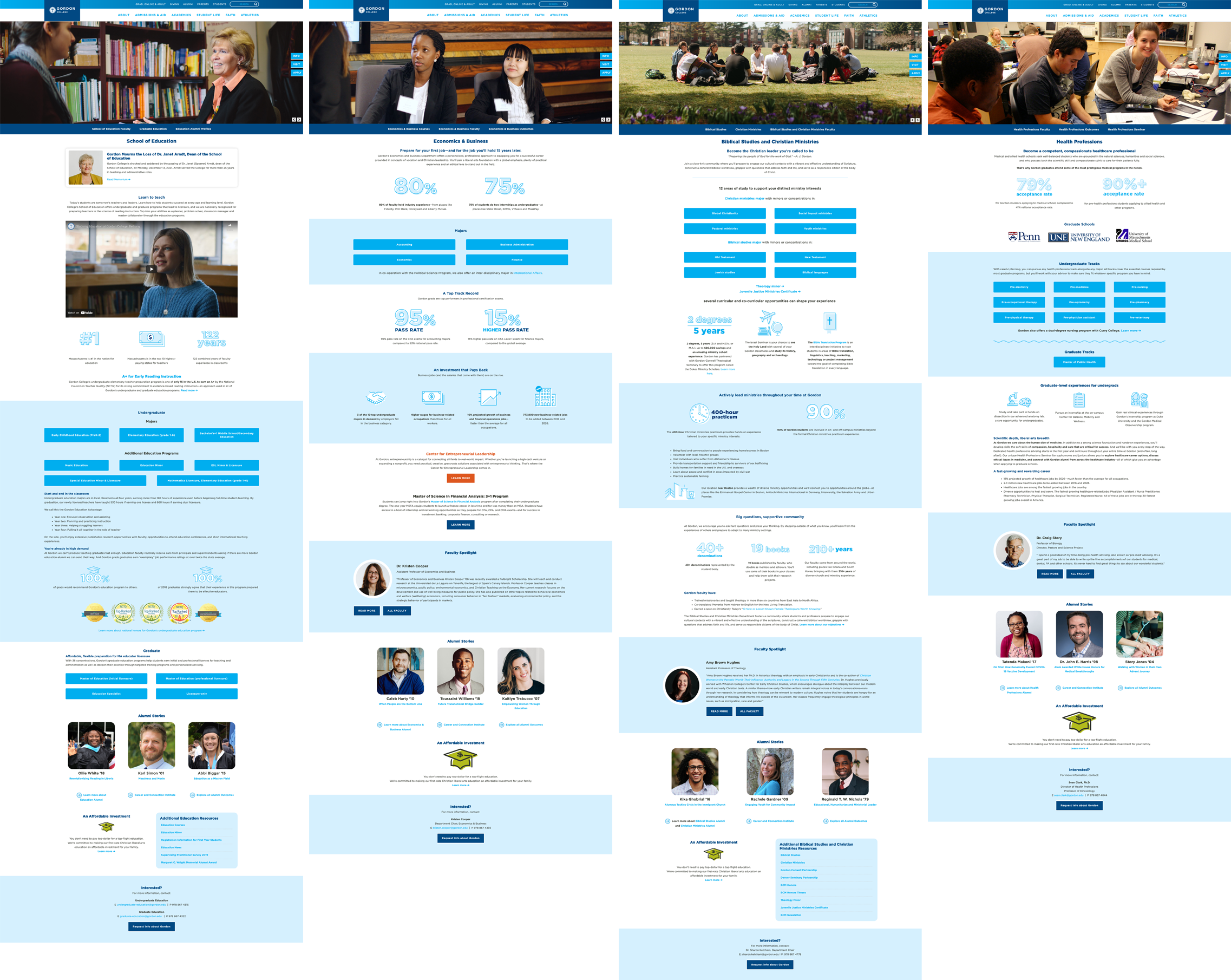
We were tasked with updating these four academic program landing pages to reinforce the messaging of the campaigns and bring visual cohesion to these target areas, which then flowed out to the overall style and branding for the email campaigns.
UNDERSTANDING THE PROBLEM
Gordon College had been struggling with either a slight decline, plateauing, or only marginal improvements in recruitment for a number of years. One of the areas identified as a recruiting weakness was in the general academic sector—Athletics and Music-related recruitment were strong and growing, but Gordon needed a strategy for fostering relationships with students who exhibited a strong academic leaning at the forefront. The Admissions team knew they needed a way to get those students connected and invested in the Gordon ecosystem as early in the process as possible.
The segmented campaign would begin with a series of emails catered to the stage of the enrollment funnel, would include specialty campus visit days, involve personal interactions with faculty members and current students, and would have a strong “nurture” component all throughout to keep interested students engaged and moving through the stages of the funnel. The web presences of these academic programs were plain (bordering on boring), short, and overall weren’t designed with the intention to “sell” or recruit—they mostly conveyed basic programmatic information. It was the goal that our redesigns of these initial four segments’ pages would pave the way for additional academic webpage updates (and potentially more segmented campaigns) every year. We needed to redesign them to look fresh, slightly cohesive, and most importantly to sell the programs.
Goals
1. Reinforce the 3-5 lead recruiting messages
2. Add video testimonials, alumni stories, and employment and graduate school data
3. Highlight internship opportunities
4. Drastically improve the promotion of advanced degree offerings
PROBLEM STATEMENT
Admissions needs four academic program landing pages to be redesigned, bringing visual cohesion and a strong recruitment message for heavy promotion during a differentiated marketing campaign. Prospective students need to see Gordon as an ideal academic fit for them, filled with faculty and students who care and want to guide them toward academic success. This would need to be done without losing the granular details of the webpages that current students and faculty rely on.
DISCOVERY + RESEARCH
The higher education environment often consults with outside firms and research organizations that specialize in high education for gathering their research. Gordon worked with Ruffalo Noel Levitz to help isolate the areas of growth in recruitment efforts. For this campaign, the four areas of study were chosen because:
– they had clear, marketable career paths
– they had faculty members motivated to recruit
– they had clear programmatic differentiators
The programs were The School of Education, Economics & Business, Health Professions, and Biblical Studies and Christian Ministries. The discovery work was completed before being passed off to us, so our initial work was largely that of validating/analyzing their plan.
Competitive Analysis
The programs themselves are all so different, so we dedicated a lot of time up-front to researching a variety of program marketing materials across many competitor schools to get an idea of what types of content they included. The task given to us was pretty clear, but we wanted to be sure that our end product would measure up to what students would see at top business and healthcare schools, for example. Focusing on student stories, internship opportunities and post-grad outcomes would be a necessity, but faculty spotlights and alumni stories could be a differentiator for us.
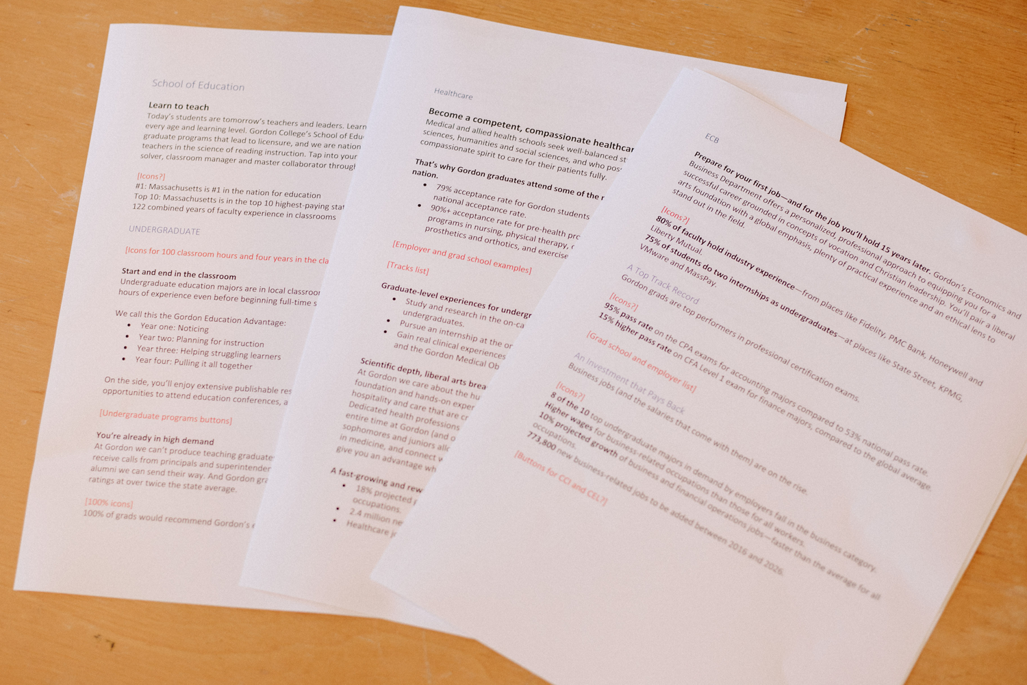
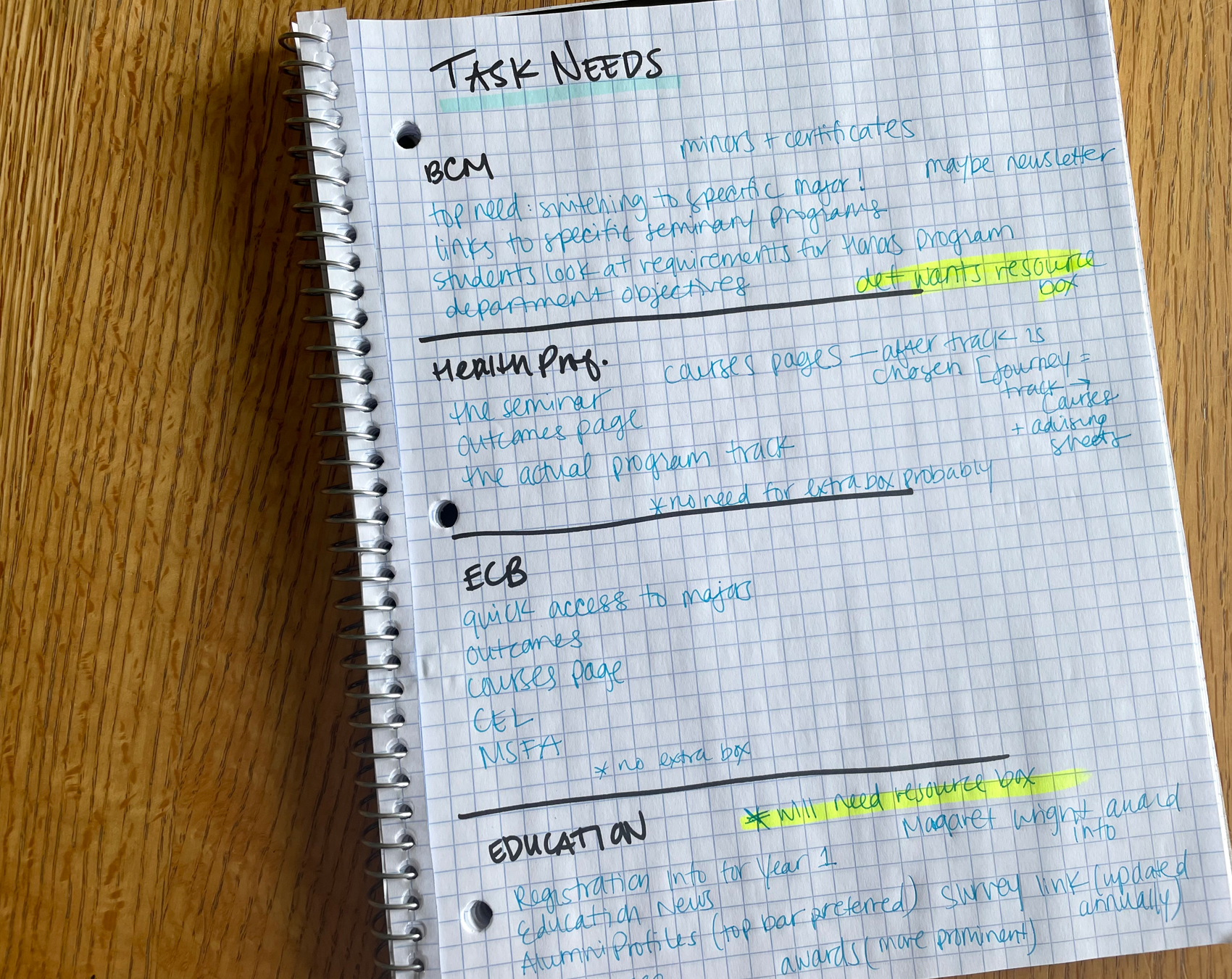
analyzing research, web copy drafts, and notes from some Task Analysis interviews
Task Analysis
I have a background in Instructional Design and had also been very privy to how users already on campus were in the practice of using the website through support calls and training workshops. Because of this, I knew that task analysis should be part of our process because in addition to being a marketing tool, the website also served as a repository for many resources existing students and faculty members regularly referenced.
I interviewed faculty members and some students from each department to hear what key resources they needed at the top level. We’d be losing a side menu with this redesign, so this led to the creation of an “Additional Resources” box on two of the four pages, and the key tasks needed were placed in the top menu bar. These users needed to perform simple tasks on the page somewhat regularly, and so while those tasks wouldn’t be relevant to prospective students and families being nurtured with the campaign, we needed to respect the current users and their recurring long-term needs. They were previously accustomed to finding these resources on the landing page, so we didn’t want to throw them by burying those tasks further down the sitemap.
IDEATION + DESIGN

Low fidelity mockup of the Health Professions page, which showcased some layout features that would be carried over to all pages.
Content Strategy + Information Hierarchy
Since we needed to bring some cohesion to four programs that were so different, we started by brainstorming how the pages would be similar, highlighting what kind of content would be featured on every page. This allowed us to start sketching a basic template using that overlapping content as anchor points. From there, we could personalize each accordingly.
Design
Since we had a lot of statistics to highlight as well as very specific program content, we created a new set of icons in our brand’s style to be used across the pages.
Iterating
We worked closely with a lead faculty member from each department during the design process, so they could have eyes on our drafts at various stages and provide feedback. These conversations were helpful for feature prioritization. We already knew what data needed to be included, but they weighed in and suggested some reorganizing. Their feedback was valuable since they themselves are users, they work closely with another user group (current students), and know what types of data may be most impressive and sought after by the new users we would be targeting with the campaign.
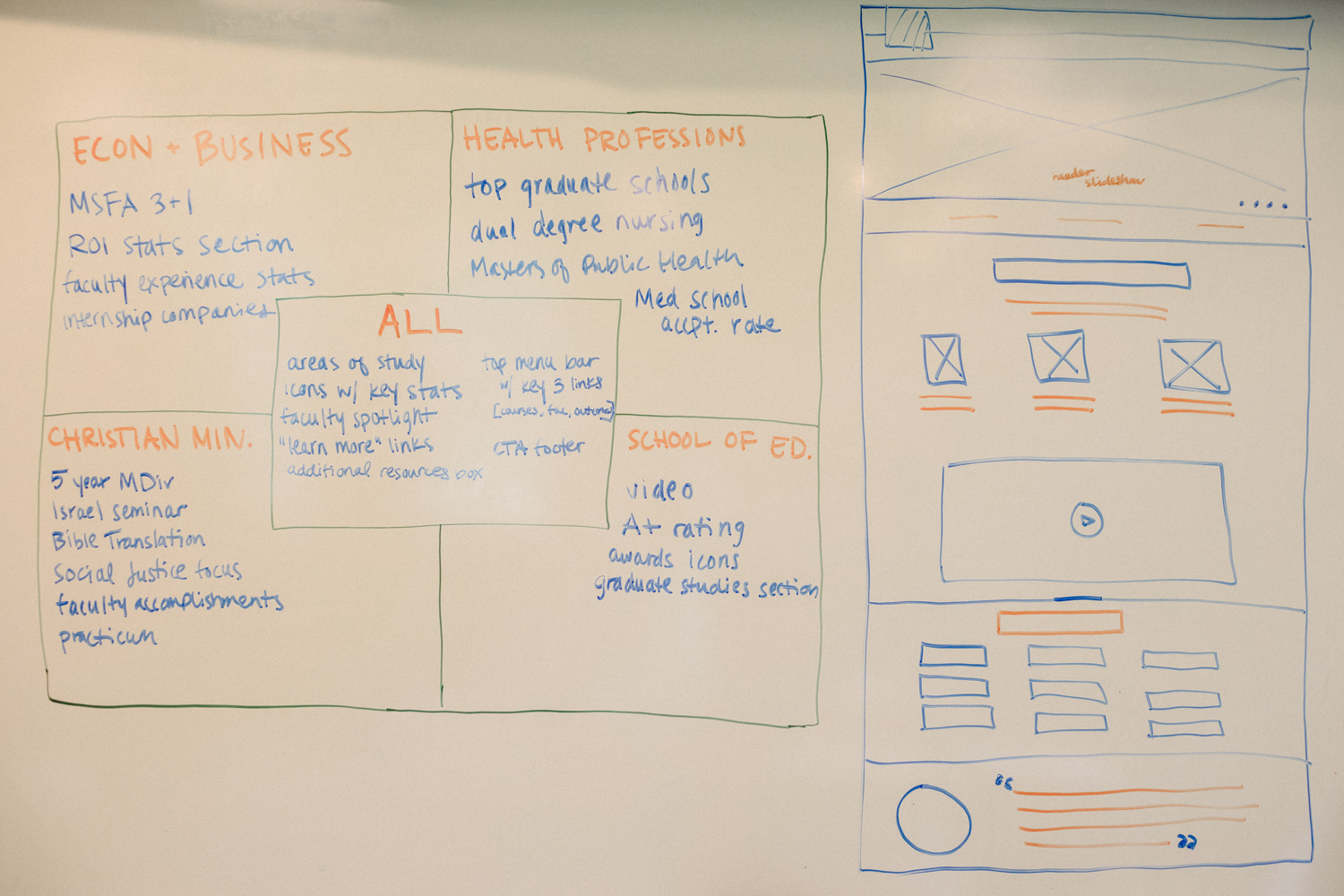
chart for strategic layout planning and an initial wireframe of The School of Education page
sample of new icon set
FINAL PRODUCT
RESULTS + REFLECTIONS
High email click-through rates resulting in large influx in page views
Drove double-digit enrollment for new small, personalized academic visit days
Though we knew our pages were only a piece of a larger segmented campaign, our pages met all of the content-related goals we were presented with and helped to meet the larger goals of the campaign. Nine emails were sent out per segment, and here are some additional ways the business goals were met (a few KPIs that our team followed up on) in addition to those above:
– Led to connecting multiple new recruits in each segment to faculty members through virtual conversations (which historically showed a high percentage chance that students would continue progressing through the funnel)
– Created a template for future updates to all academic pages, saving time and money on upcoming design work
– Increased views on pre-existing, relevant video content
Higher education prospects require a lot of nurturing to move through the funnel. Since the end product requires a massive financial investment on the part of the student and family, an immense amount of work can be required on behalf of the institution to get them across the finish line. This campaign created a way for four specific segments of the prospective base to have 10+ additional touchpoints for nurturing those leads.
One challenge that I had to overcome with this project was getting buy-in from four different departments with their own preferences and opinions. They each had goals and ideas for what they saw as most important, and they wanted an individualized, custom end product that highlighted the items that were most important to them. I had to explain and ultimately win them over to the fact that we needed some cohesion among the pages. While this is a small segmented campaign right now, the end goal will be for these designs to be carried across all majors, and it’s important for users exploring our site to have a familiar experience while navigating. For example, I explained that a student who is deciding between Psychology, Health Professions, or Biology as their major shouldn’t visit those three pages and feel like they entered three different worlds—all with different menu structures, hierarchy of information, or even colors. I had to get them on board with the idea that we had one very large website holding tons of content, so browsing similar content should feel similarly. I encouraged them to help me bring individuality to their program pages with the content itself. It took multiple conversations with some, but ultimately we ended up with final pages that we could all feel proud of, and I know that users of our site as a whole will be best served by the consistency.
