Understanding ROI of a College Education
AN IMMERSIVE EXPERIENCE FOCUSED ON ALUMNI OUTCOMES
My role
project lead
research analysis and strategy
information architecture
visual design
low-fidelity wireframes
high-fidelity mockups
workflow management
front-end development
My role
project lead
research analysis and strategy
information architecture
visual design
low-fidelity wireframes
high-fidelity mockups
workflow management
front-end development
OVERVIEW
Gordon College is a small liberal arts college, and in the current landscape of higher education, it’s more important than ever for prospective students and parents to feel confident in their investment.
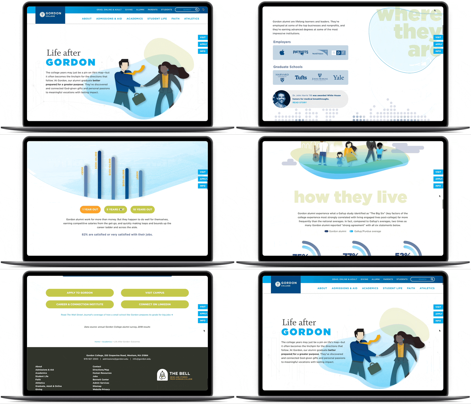
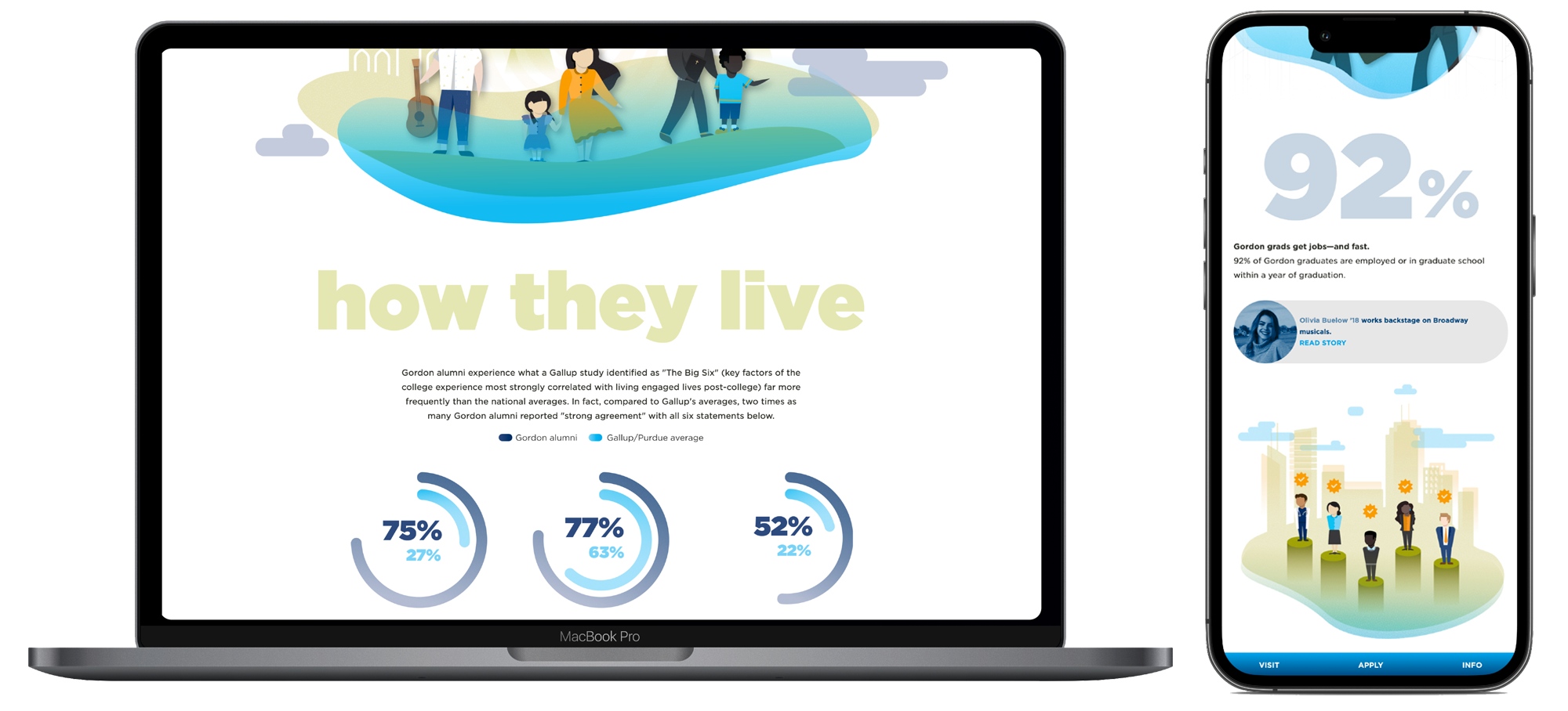
This page was designed so that families could have a lively, enjoyable experience while they learned what the future could look like if their student chose to attend Gordon College. We aimed to create a data-heavy page that presented the most impactful information in an approachable and easy-to-interpret manner.
UNDERSTANDING THE PROBLEM
Higher education is a sizable investment, but small, private liberal arts colleges face a unique struggle as they attempt to communicate their strengths in this competitive marketplace. A few of Gordon College’s key competitors already had ROI-focused online resources available that effectively sold the value of their product to families.
The Admissions team asked the Creative team to create a web resource and corresponding branded visuals that they could feature prominently in their drip and nurture email marketing campaigns. As a part of their recruitment strategy, they were planning to focus on value by highlighting alumni outcomes across an array of areas.
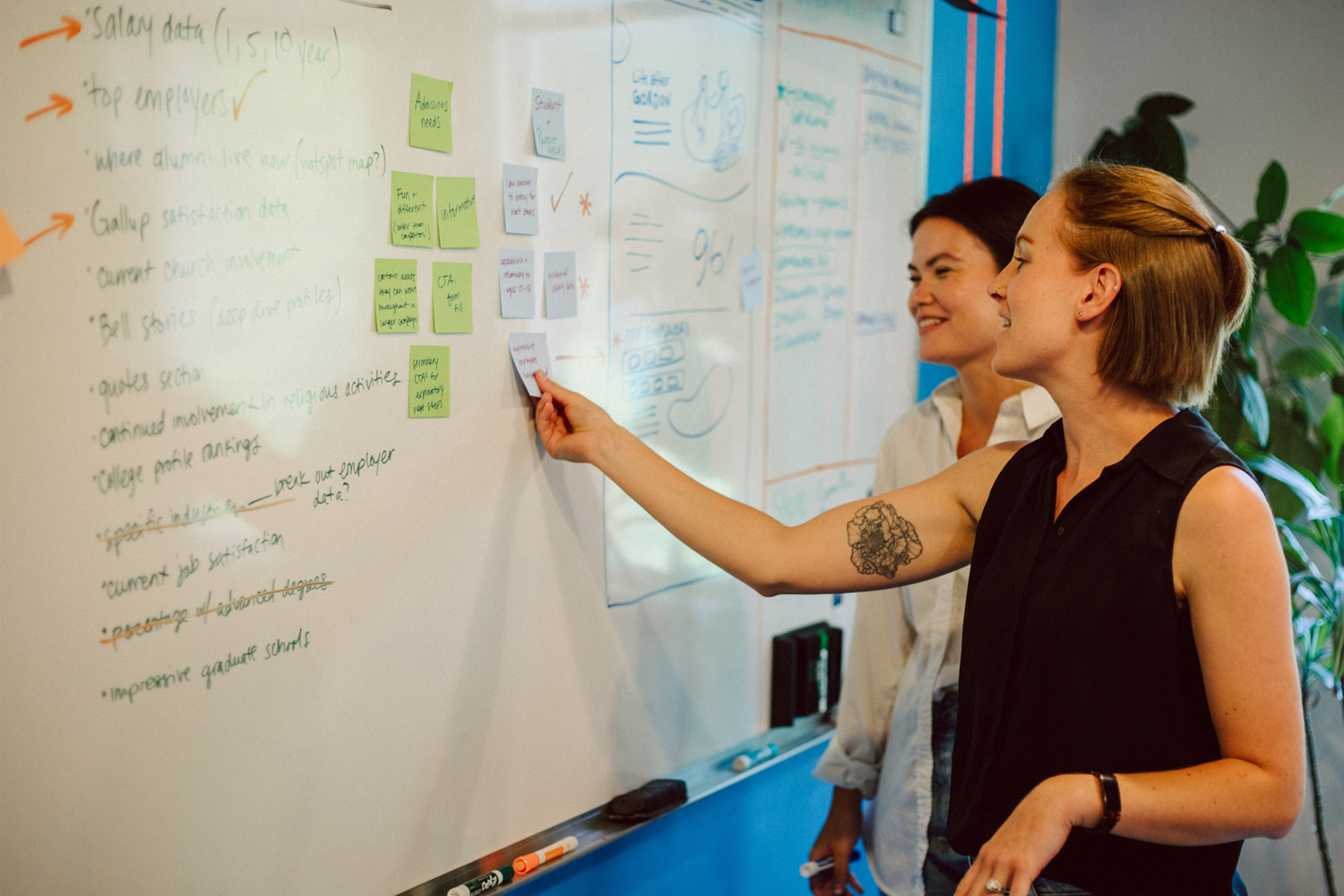
Based on research conducted by both the Gordon College Alumni Office as well an outside firm, we sifted through the data to discern what information would be effective and impressive, while also weighing what would translate best visually to make for a compelling and engaging page.
Goals
1. Identify strongest data to highlight value against competitors
2. Work within the College brand framework, while pushing the design forward to create an edgier, more unique resource (to compete with peer schools and appeal to the younger prospective student demographic)
3. Include appropriate calls to action that would move prospective students into or further through the enrollment funnel
PROBLEM STATEMENT
Admissions needs a captivating webpage and corresponding branded visuals to use in an outcomes-focused email campaign, to continue guiding prospective students through the enrollment funnel. Prospective students and families need one simple and inviting resource where they can get a broad view of employment outcomes, satisfaction levels and alumni stories, so they can hopefully see Gordon as a strong fit.
DISCOVERY + RESEARCH
Analyzing the Research
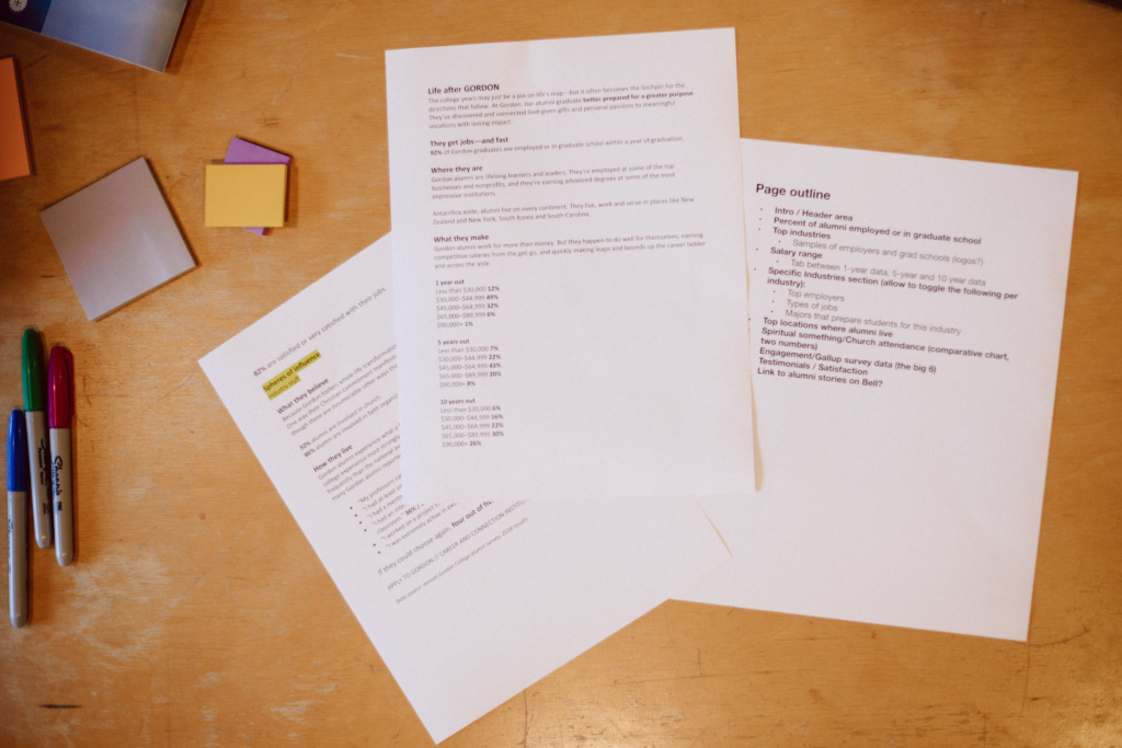
Before we conducted interviews, we pored over what we already had available to us.
What we had
– Alumni survey data over 10+ years
– Gallup satisfaction survey data
– Alumni interviews and stories
– Admissions team’s assessment of what they needed to show
What we needed
– To confirm student and family needs/interests
– Competitive analysis of peer institutions
Competitive Analysis
To start our research, we analyzed three top competitor’s similar resources concerning content and design and found:
– they were all very photo-centric
– they contained statistical employment-related data and personal life satisfaction data
– one linked out to more long-form alumni stories
– one was a more immersive page while the other two stayed consistent with the overall web layout
To stand out against the competition and meet Admission’s request for something fresh-feeling, we decided to explore the use of illustrations and steer away from heavy use of photography.
With this approach, we knew it would feel different and fun, and also hoped it would keep the concept of alumni general so that any viewer could see themselves in the content (as opposed to so many specific faces).
User Interviews
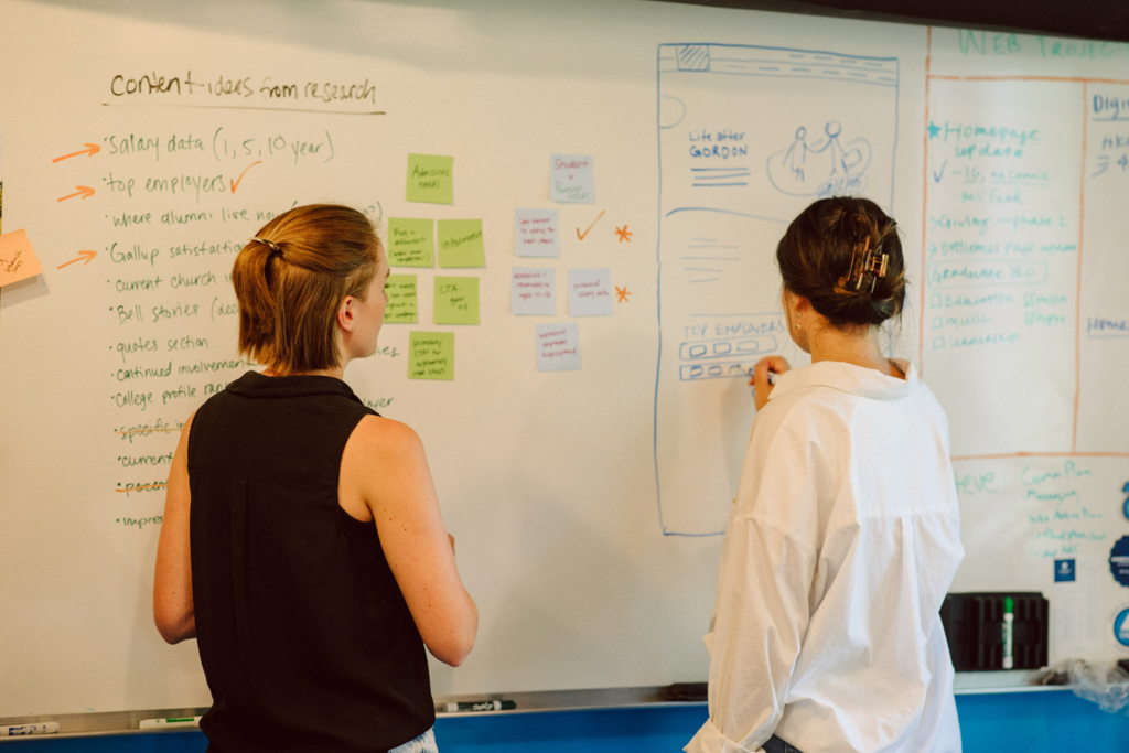
As we were analyzing our pre-existing data, we strategized for how to gather the needs of both our users (students and families) and also the primary stakeholder (the Admissions team). We had regular weekly meetings with Admissions so it was straightforward to ascertain their needs—they needed their their initial recruitment form to be the primary call to action, and they also wanted some digital assets that could be carried through their email marketing campaign.
For the primary users of the page, we partnered with Admissions to gather information through continuous interviews as a part of visit day programming to learn about what data was most important to families when thinking about life after graduation.
IDEATION + DESIGN
Branding
“How might we create branded content but have it feel edgy and set apart?”
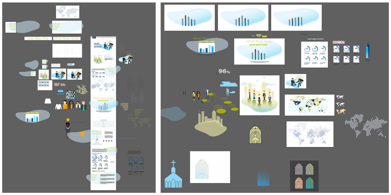
We operated within our brand framework, with a twist. We employed our heaviest font weight which felt fresh and new since it didn’t previously get a lot of use, and used two of our primary brand colors but chose lighter tints. It felt related and cohesive, but distinct among the large quantity of Admissions content.
Illustrations
We were thrilled to finally have a project where we got the go-ahead to use illustrated figures instead of photography. We knew it was becoming a popular choice in web design at the time, but higher education can be slow to embrace things outside of its typical wheelhouse.
Iterating
“How might we move the user through data in a visual way?”
“How might we gently lead students to complete the form?”
“How might we encourage additional movement through our larger website to keep users engaged and learning?”
After receiving some initial feedback, we decided to make the following changes with subsequent drafts:
– shortened text areas
– move away from the expandable menus that broke employer data down by industry
– brought movement to the illustrations to keep it lively and interactive-feeling
– incorporated additional text-based links to other stories and resources

FINAL PRODUCT
It was a really fun design process, and we were excited to present Admissions with a cutting-edge resource that stood out among the competition, and prospective students and their families with a fun, informative resource to help them see what the future could hold if they chose Gordon College.

RESULTS + REFLECTIONS
Double-digit increase in weekly form fills after launch
Consistent click-through rates from emails
High interaction rate with secondary CTAs
Strong persuasion piece with parents based on user feedback
While we were pleased with the overall design of this page, we had our doubts from the beginning as to whether or not it would lead to many conversions for the Admissions team. We advised them to condense their form from the outset, explaining that the barrier of entry for users was too high. Even though we were able to support our case with evidence from Google Analytics on other web pages, that piece of the project was out of our hands—Admissions had goals and requirements imposed on them (both internally and from an outside consulting group) and didn’t feel equipped to push hard against the number of form fields at that time. The Creative team believed the strict dedication to that long form ultimately cost them conversions in the end.
The webpage alone as a static piece wouldn’t have led to many conversions, but the illustrations and branded content that initiated with our page provided them with a strong foundation for their email marketing campaign around alumni outcomes. Their emails had strong click-through rates, and heat maps we assessed throughout the campaign suggested a level of interaction with our page and the secondary CTAs that we were satisfied with, even if conversions via the form were on the lower end. There was still a double-digit increase in overall weekly form fills upon the launch of this campaign, but the increase wasn’t sustained over time. Finally, we have in-person, word-of-mouth evidence that this resource served as a strong persuasion piece to prospective parents. During in-person Admissions visits, about 10+ parents commented on the page and emails, and gave positive feedback which was passed along to us. We all acknowledged that the webpage itself was just a piece of the larger puzzle for this recruitment effort.
